At Feezee, we believe what’s on the outside should be just as exciting as what’s inside. That’s why our bottle designs aren’t just packaging—they’re part of the experience. In this blog, we’re giving you a peek into how our vibrant, eye-catching bottles were created and why they’ve become fan favorites.
Here’s what makes our bottles unique:
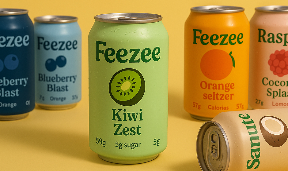
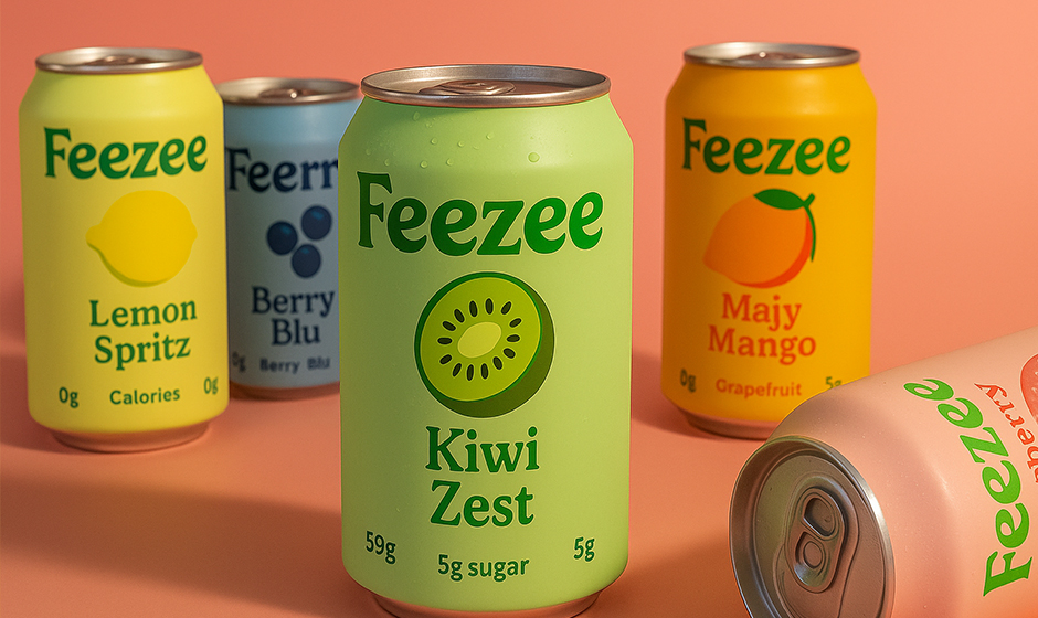
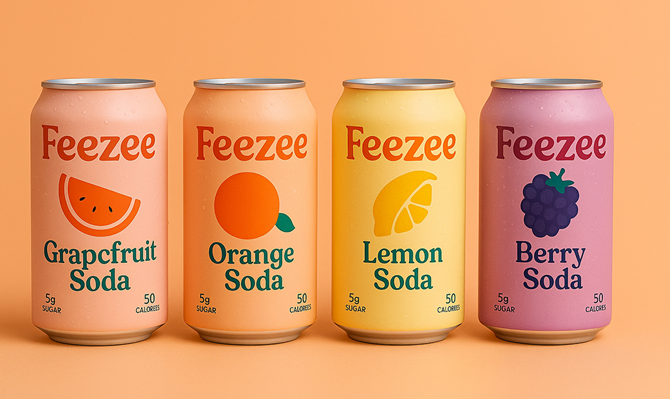
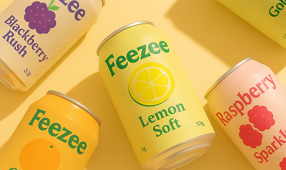
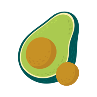
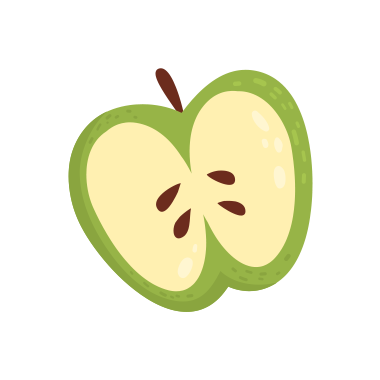
- Inspired by Flavor: Each bottle design is directly inspired by the drink’s personality. For example, Freshi Kiwi features a zesty green vibe, while Berry Grapes uses bold purple tones—all hinting at the flavor inside.
- Designed for Shelf Appeal: Our creative team worked with leading designers to ensure that Feezee bottles stand out in stores. The result? Bright, clean labels with modern fonts and playful icons that instantly grab attention.
- Easy to Hold & Recycle: The shape isn’t just stylish—it’s functional. Our bottles are easy to grip, great for travel, and made with recyclable materials that keep both you and the planet refreshed.
- Social Media-Ready: From parties to poolside snaps, Feezee bottles were made to be shared. Their aesthetic look and bold colors make them a hit on Instagram and Reels—and yes, people actually save them as props!
Design Tips We Follow:
- Keep it colorful, but clean
- Match the flavor with the visual tone
- Always include playful, feel-good energy
Our goal? To make every Feezee bottle feel like something special—before you even take a sip. Because when you grab a Feezee, you’re not just buying a drink… you’re picking a vibe.


.svg)